Guide de Branding – Le Dépôt
Revision of the Dépôt branding guide to modernize the style and formalize communication practices.
The Depot had a basic branding guide that needed updating and expansion to better reflect their brand identity. I modernized the guide while respecting their colors and style, adding the following elements:
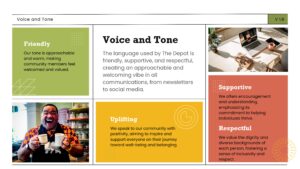
Tone and Voice
There were no clear guidelines on the tone to adopt in their communications. I therefore clarified this point in the guide so that anyone using this document would know exactly what tone to use, whether for formal or informal communications.
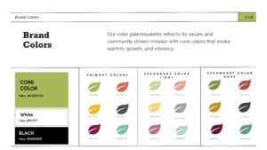
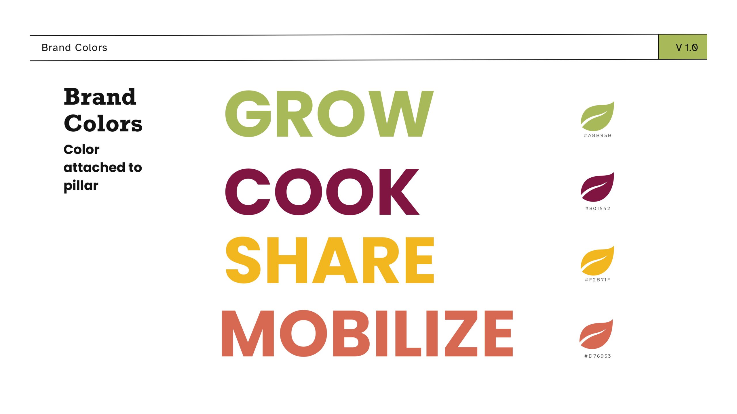
Color Palette
Their initial palette, composed of bright colours, lacked contrast. I added:
- Some secondary colour to balance the palette,
- Some tertiary colors to expand graphic possibilities and improve readability.
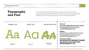
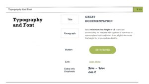
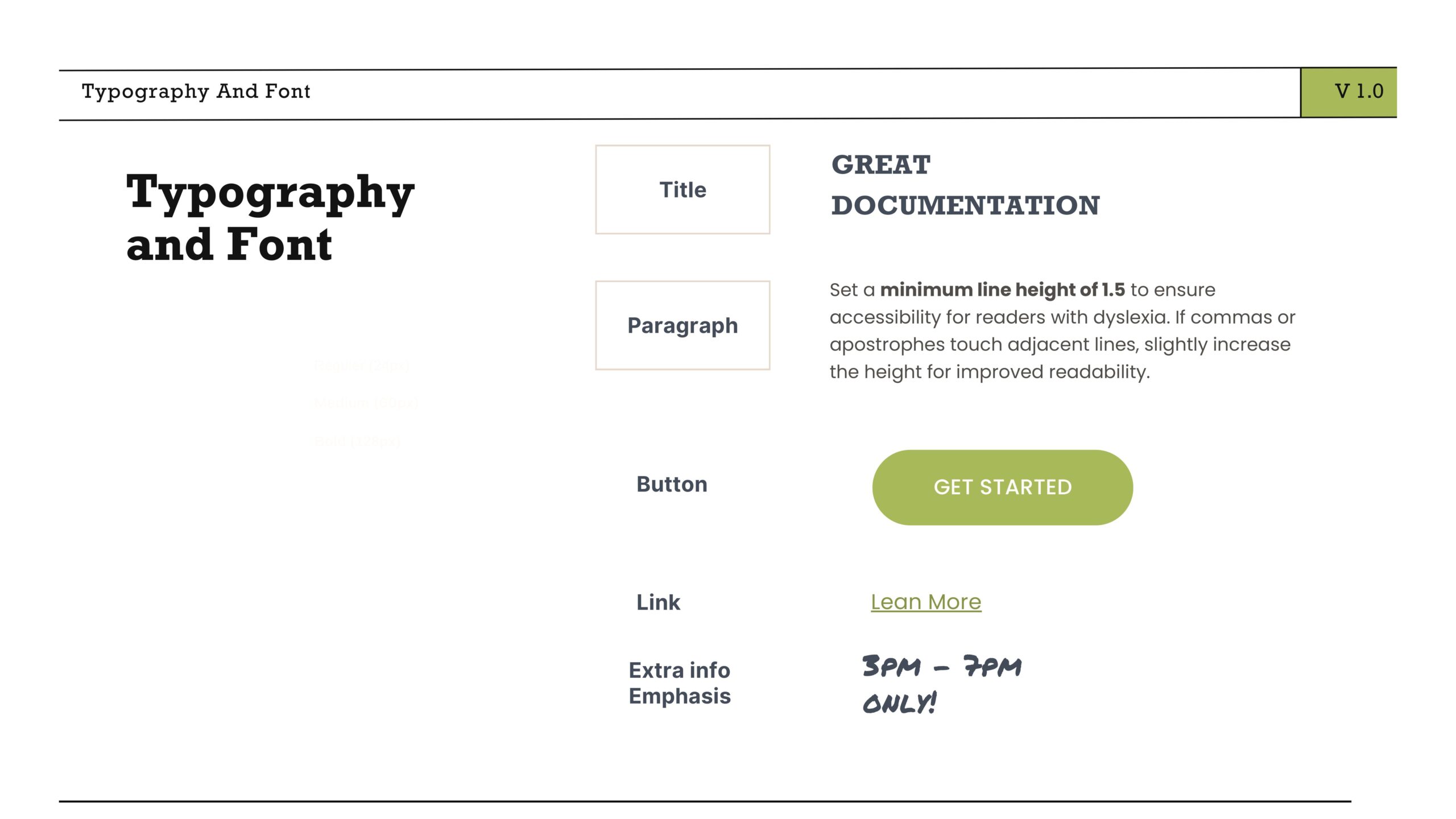
Typography
I revised their typographic choices to create more contrast:
- Poppins stay used for everyday text
- Rockwella serif font, is now used for titles, adding an elegant and distinctive touch.
- At their request, I also added Permanent Marker for more grassroots and playful posters.
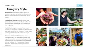
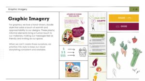
Graphic Style and Imagery
The graphic styles (hand-drawn illustrations) and choice of imagery (photos of people) were well known among colleagues, but were not documented anywhere. The guide now formalizes them as central to their communication vision.
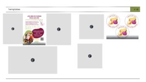
Model and Template
Although not included in the presentation for this portfolio, templates for their presentation materials and documents are available in a centralized database. This ensures that everyone knows where to find them and how to use them, maintaining consistency in their image.